Hi, I’m Josh and I have a coffee addiction.
There’s something about that bittersweet java that entices my mind and makes me yearn for the next cup.
I think if I was ever to go into retail I’d definitely consider coffee as a potential business, but then again, I’d probably end up drinking all the profits.
There must be a lot of people like me because it seems like there’s a coffee shop or cafe tucked into every corner, in every major shopping center and strip mall.
Such a saturated industry actually makes for really interesting research case studies though, because there is an abundance of information and lots of people thinking about how to innovate in the industry.
That’s why I chose coffee suppliers as a focus for today’s post because they have some of the most advanced customer acquisition and promotion strategies in the world of business.
Someone needs to sell all the high-quality coffee we find in cafes, coffee carts and restaurants all around us but it also turns out there’s quite a booming business for the wholesale supply of not only coffee, but also coffee machines, grinders, accessories, and even training.
Today, I’ve zoomed in on 4 of Australia’s most prominent coffee suppliers to take a look at their wholesale partnership recruitment pages.
Why You Need A Good Wholesale Recruiting Page
Any good business thrives on the quality and quantity of leads that come in every day.
If you don’t have a repeatable and consistent way to get customers, the fact is you don’t have a business.
For wholesale suppliers, your source of leads is your recruitment page.
Aside from this, you need a good wholesale recruiting landing page to:
- Tell people about your business
- Show them what to expect when dealing with you
- Outlay how they will deal with you
- Give them a way to get in touch
In this post, I’m going to analyze 4 of Australia’s most prominent coffee suppliers so we can see what they’re doing right and wrong and learn from it.
We will look specifically at:
- Page Structure – how the page is constructed, what sections it includes
- Notable Details – any notable additions that you could copy
- What Is Missing? – what is missing from the landing page
- Lessons & Take Aways – my impression of the recruitment page and what they could do better (if anything)
In no particular order, let’s get stuck in reviewing their landing pages.
Coffee Supplier #1: Di Bella Coffee
Page Location: Di Bella Coffee
Page Structure
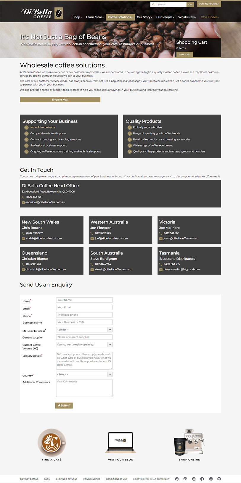
Di Bella promises the customer that they’re not just a bag of beans. They provide no-lockin contracts and they specify who they are targeting: cafes & restaurants.
Their opening overview talks about who they are and what they want to do for the customer.
Next, they have a high-level call to action button that captures the people who already know about them and are happy to be moved on to the call to action quickly.
The following split section shows a list of benefits of being a Di Bella wholesale customer and also some high-level points about their product.
They have a very thorough breakdown of contact people.
Finally, they finish with a submission form to capture people’s details.
Notable Details
Di Bella does a good job of making their copy benefits focused meaning it speaks to the customer and what they get when they sign up with Di Bella.
They also have a really great breakdown of who to contact which also tells me a bit about the size and stability of the company. If they can afford to have reps in each state and are spread out nationwide that means they must be a solid company that a lot of people choose.
What Is Missing?
The main thing that was missing for me on Di Bella’s landing page was information about the process.
How do I sign up? Do I call the sales rep in my state or do I fill in the form?
And what happens after that? How do I make orders and when is it delivered? Are there any hurdles to jump through? Any training required by their team?
There’s a lot of questions that are left unanswered.
Lessons & Take Aways
A landing page doesn’t have to be very long to portray the required information. Di Bella does a great job early on the page of capturing attention with benefits related copy.
A call to action is only as strong as it’s instructions. Leave no question unanswered before asking for the call to action. Then, follow up by making sure, you should specifically tell them what to do and what will happen next.
Coffee Supplier #2: Merlo Coffee

Page Location: Merlo Coffee
Page Structure
The heading says they’re more than just a coffee supplier which speaks to their desire to be a holistic solution provider for cafes.
The overview section that follows talks directly to the primary target audience: New coffee shop/cafe/restaurant owners.
Next a set of success stories in the form of case studies from 3x existing partners.
An FAQ section is shown after that to answer any immediate questions before signing up.
Finally, a call to action with a sign-up form which also says what will happen next.
Notable Details
Case studies provide social proof and sub-conscious knowledge that people are using Merlo and are happy in their choice.
The page also speaks to a specific audience in new shop owners that need a coffee solutions provider.
What Is Missing?
For me, the main thing that was missing was an easy to consume benefits list detailing what is in it for them.
The first section “Merlo in your cafe” starts off well but quickly devolves into talking about themselves. This is the place to talk about the customer and what the benefits of signing up with Merlo would be to them.
Lessons & Take Aways
You only get 3-5 seconds to grab someone’s attention on a landing page. Don’t waste it.
By talking about themselves too early on and not enough about what is in it for the customer, Merlo loses a lot of their audience before they can move onto the more powerful aspects of the page such as the case studies and the FAQ section.
Coffee Supplier #3: The Coffee Roaster
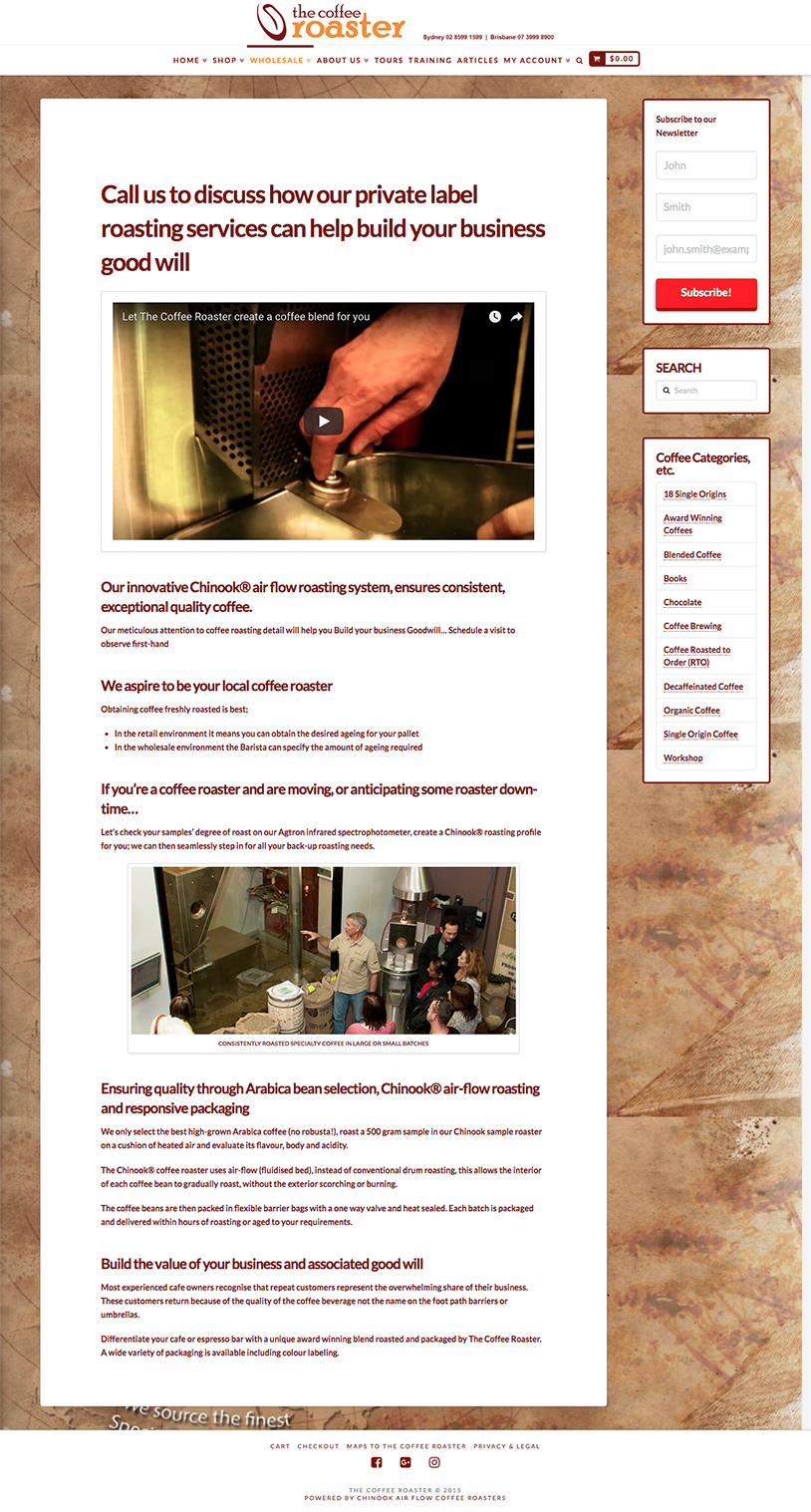
Page Location: The Coffee Roaster
Page Structure
The Coffee Roaster actually has a section with a few pages surrounding wholesale details, but this main page contains all the information – the rest are more for additional information on those sub-topics.
The page opens with a headline that is doubling as a call to action asking the customer to call them.
They have a fantastic video detailing their unique roasting process and why they’re different. The video finishes with how that can benefit the wholesale customer.
The rest of the page focuses on product information but it does finish with a benefit focused section which associates that unique product approach back to the business value for the customer.
Notable Details
The video is a fantastic way to communicate a complex argument that individual roasting profiles can help distinguish the cafe of the wholesale customer from the cafe down the road using the same blend as everyone else. This would have been much harder to achieve with words alone.
What Is Missing?
A clear call to action is completely missing from the page. They do have some wording in the heading this is too early and a waste. There are no details about how to contact them or what to do next to set up a wholesale account.
Lessons & Take Aways
Providing all the information and value isn’t enough. You need a clear call to action that specifically says what to do next otherwise people will say “that’s nice” and move on.
The simple fix here would be to add a contact form to the bottom of the page with instructions on how to apply for a wholesale account and what to expect next in the process.
Coffee Supplier #4: Campos Coffee
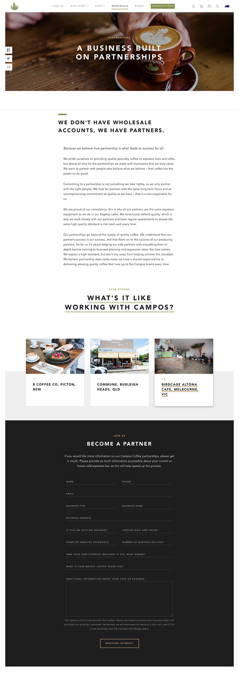
Page Location: Campos Coffee
Page Structure
The Campos landing page is professionally designed and starts with a large heading describing what the page is about: creating two-way partnerships.
Next, an overview section focuses on selectively removing companies that are not a good match for Campos.
They back this up by showing some of the companies that made the cut. This proves they are selective and that only the best businesses get to be a partner.
This all sets the stage for the call to action which is a nicely laid out form, not too overwhelming.
They finish by setting expectations that their goal is not to oversaturate the market with Campos outlets and that they are quite picky about who gets to be a partner.
Notable Details
Being selective about who you work with might seem like you’re removing some of your leads unnecessarily, but it actually has the opposite effect.
The lead volume will decrease, however, the quality of the leads that do come through will be better and you will waste less time on tire kickers. Campos understands this and is making a bet on their company motto of uncompromising quality to attract like-minded cafe owners.
This focus on selectiveness also interestingly shifts the power dynamic back to the business. Campos isn’t competing for leads, the leads are competing to have the opportunity to join Campos.
When was the last time you had customers even begging just for the opportunity to buy from you? Campos does every day.
What Is Missing?
There’s one thing missing on the page though and that is a clear benefits list – why should I join Campos in the first place?
Everyone says they are the top quality product, but that isn’t enough. There are hundreds of other coffee suppliers all claiming the same thing.
More information about what they will get being a wholesale customer would set it up even stronger.
Lessons & Take Aways
The call to action for Campos is really strong because they’ve selectively removed the bad leads already.
To the right person, this would be irresistible. It’s a great strategy to reduce volume but increase lead quality dramatically so your salespeople don’t have to work through the bad leads.
What Should You Put On Your Wholesale Partner Landing Page?
So now we’ve looked at all of our candidates for today, you might be wondering what makes the perfect wholesale partner recruitment landing page?
We’ve put together a bunch of factors that we think would create the most value-packed amazing landing page to recruit new customers.
1. What Is In It For Them
First an foremost on any landing page on your site you need to immediately show them what is in it for them. This is called your benefits list.
The first part of any landing page should be benefits focused. The most common mistake is focusing on yourself too much.
Always keep in mind “what is in it for them” and you will automatically create copy that sounds appealing to your potential customers.
2. Introduce Your Company
While it’s important to show what is in it for them, joining up with a supplier is a big step for a company and they might require some extra reassurances.
Wholesale level customers will require you to introduce yourselves and give a bit of background about who you are, how big your company is, and that you are a reputable supplier to deal with.
3. Provide Basic Product Information
A basic understanding or overview of the type of products you provide is a good way to get across what you are all about without giving them a huge rundown of your history.
This might take the form of a product sheet or even just a broad overview of the types of niches you serve.
4. How Your Wholesale Program Works
Details on how your wholesale customers order from you, how shipping works, how returns work might sound basic but it’s all adding to the perception that this is an established and safe supplier relationship and that they will be looked after.
Providing extra details on how your program works specifically can help with answering a lot of questions they have bubbling away in their brains but they aren’t able to verbalize to you yet.
5. Video
A video introduction from you to them is a great way to show your customers that there are real humans running this program.
Video engagement is at an all-time high right now, so in addition to communicating in written words on your page, a video will capture the people who don’t want to do all that reading.
You don’t have to limit it to introduction videos either. Mix it up with product-related videos, testimonials and more.
6. FAQ
A good FAQ can do a lot to answer many of the common questions about your program and what it’s like to you in a format that is quite familiar and unintimidating.
In addition to this, you might like to include a link to another page where they can email you to ask pre-signup questions.
7. Links To High-Quality Case Studies
Case studies are great for showing what it’s like to work with you.
Ask your top 2 or 3 wholesale customers to provide a testimonial or, if you can afford it, have a film crew go out and do a more in-depth case study with them.
8. A Strong Call To Action
One of the most misunderstood elements is the call to action. People tend to be too shy to tell people what to do next and that is where a good landing page shines.
A landing page serves two purposes:
- To provide information
- To inform the visitor what to do next
It should be a single action and you need to tell them in very clear language what to do.
For a wholesale recruitment landing page, this will likely be to fill in a form to apply for an account.
9. Set Expectations
Finally, one of the last things you should do is set expectations of when they will be approved or at least what the process is and how long it takes.
This will remove the questions of “when will my wholesale account be ready” and ensure they clearly understand what is happening after they submit their application.

