As a busy store owner, WooCommerce checkout optimization may not seem worth your time and effort. Unfortunately, having a clunky and outdated checkout page can scare away potential clients, which can lead to issues such as cart abandonment. Over time, such problems can lead to significant revenue loss.
Fortunately, making a truly awesome checkout page is something any wholesale store owner can do. All you need is information on the best checkout page optimization strategies and the worst checkout page design errors to avoid.
In today’s post, we’ll give you a handy all-in-one guide on how to optimize your checkout page. In addition, we’ll discuss the mistakes you should steer clear of when designing the checkout process.
Let’s jump right into it!
WooCommerce Checkout Optimization Cheatsheet
Are you looking for ways to optimize your checkout page for better conversions? Then know that you can find loads of WooCommerce checkout optimization guides on the internet.
Unfortunately, most guides are ridiculously long. And we know that, because you’re a busy wholesale business owner, you can’t spare the time and effort to read all those guides.
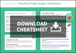
Well, worry no more, because we’ve prepared for you an all-in-one guide for optimizing your checkout page on your e-commerce website. This guide is short and to the point, distilling all the information you need into one handy PDF cheatsheet.
Click below to download our WooCommerce Checkout Optimization Cheatsheet!
This cheatsheet summarizes everything you need to know about checkout page optimization. By using it, you get to avoid wasting time reading all those tedious online guides. As a result, you can focus on what’s truly important: designing the best checkout page possible.
5 Checkout Page Mistakes That Can Hurt WooComerce Checkout Optimization
A clunky and outdated checkout page can discourage customers from buying products from your online wholesale store. For this reason, you should keep an eye out for the errors that can hurt your WooCommerce checkout optimization.
In this section, we’ll discuss five of the worst checkout page mistakes that can hurt your WooCommerce checkout optimization. These mistakes are as follows:
1. Asking for too much information
Don’t you hate it when online forms ask you to fill out the same boring info over and over again? Well, your customers do, too!
So, ask yourself, does your checkout page really need all those fields asking your customers for so much data? For example, do you need to know a customer’s age and hair color? Or will information such as their payment details and physical address suffice?
In short, try trimming down unnecessary fields and ask for the essentials only. Additional details can be requested at a later time, such as after the transaction is complete. Alternatively, you could remove extra fields altogether.
Online transactions are a way of life these days, so people generally don’t mind giving away their info. However, the fewer the fields on your checkout page, the greater the chances that people will fill them in and complete their purchase.

2. Only offering one payment method
According to a 2009 study, 50% of online shoppers cancel their purchases if their preferred payment option isn’t available.
As horrifying as that sounds, there’s good news: simply adding an extra payment method to your checkout process can drastically increase the odds of someone completing their purchase.
For example, when we first launched Wholesale Suite, we offered only one payment option: PayPal. Within a month, we received a flurry of emails from unhappy customers. Many of them didn’t hold back from expressing their distaste for PayPal; almost all of them demanded more payment options.
This, as you can imagine, took us by surprise. Thankfully, we were quick to add Stripe as an alternative means of credit card payment. And just like magic, our conversion rates shot up overnight. So the moral of the story is this: give the people what they want, or risk being left with a half-eaten sandwich.

3. Too many distractions
When launching an online wholesale site, many theme developers forget the importance of WooCommerce checkout optimization. This is a huge mistake that can result in significant revenue loss if not promptly resolved.
The checkout page serves the critical purpose of guiding customers to finalize their purchase and part ways with their cash. Unfortunately, having a sidebar full of links or a header with loads of options can distract a customer from completing their purchase. Even worse, it can frustrate them, encouraging them to abandon their cart.
Therefore, you should reduce the number of distractions to zero. We recommend examining our checkout page as an excellent example of a low-distraction checkout experience.

4. Too many shipping options
Many website owners are unaware of the potential hold-up that offering an excessive amount of shipping options can create for their customers.
Thus, we recommend providing just two options: standard shipping and priority shipping. And if it’s feasible with your business model, consider offering free shipping as it can be a real game-changer.
Additionally, it’s important to ensure that once a customer qualifies for free shipping, all other options are removed. This simplifies the process and frees up your customers from the frustrating bottleneck of decision-making.

5. Getting too fancy with the layout
We’ve noticed a rather troubling trend among designers lately: the creation of multi-page checkouts that extend over 2, 3, or even 4 pages. It’s absolutely maddening!
Breaking up the form fields into small, digestible chunks may seem like a wise choice. In reality, it forces customers to make 4-10 more clicks as they continuously juggle keyboard and mouse just to navigate through the checkout process.
A short, streamlined checkout form that fits a single page is sufficient for 95% of e-commerce websites and can do wonders for WooCommerce checkout optimization.
In contrast, multi-page experiences do nothing but introduce more mouse clicks. The more clicks a customer has to make, the more annoyed they’re likely to become and the higher the chances of them abandoning their purchase. Therefore, keep the checkout process as simple as possible and minimize any potential sources of irritation.

Wholesale Order Form And WooCommerce Checkout Optimization
Don’t want to miss out on potential sales and customers? Then don’t neglect your checkout process; invest in a top-notch, optimized, and visually appealing checkout experience, then watch the money roll in!
And in case you’re wondering how you can design a snazzy checkout page, look no further than our Wholesale Order Form. This 5-star WooCommerce plugin makes the ordering experience faster and more efficient for your customers. Not to mention it works well with other WooCommerce tools to ensure you have everything you need to ensure the success of your business!
Conclusion
WooCommerce checkout optimization is crucial if you want your e-commerce store to enjoy high conversion rates. Thankfully, the right information can help you design a checkout page that your customers will love.
In this article, we gave you the link to a downloadable WooCommerce Checkout Optimization Cheatsheet that can help you in the checkout page design process.
And here are the five mistakes you should avoid if you want to maximize your WooCommerce checkout optimization:
- Asking for too much information
- Only offering one payment method
- Too many distractions
- Too many shipping options
- Getting too fancy with the layout
Do you have any questions regarding how to improve your website’s checkout experience? How about the various ways you can use Wholesale Order Form to maximize WooCommerce checkout optimization? Feel free to reach out to us in the comments section below!


Hi Josh Kohlbach
Thanks a helpful Cheat Sheet.