Did you know that a great deal of customers abandon their carts due to cumbersome checkout processes? Implementing WooCommerce checkout page customization strategies can help you create a frictionless shopping experience and avoid this pitfall. Fortunately, doing this is a lot simpler than you think!
In this article, we’ll talk about four ways to improve your WooCommerce checkout page and why it’s critical that you do so. So, let’s dive straight into it!
Why Optimize Your WooCommerce Checkout Page?
Around 76% of e-commerce users abandon their shopping carts before they get through the checkout stage. In many cases, those users might not be intending to make a purchase at all. However, that’s still a significant figure that you shouldn’t ignore. When it comes to customers who have a real intent to make a purchase, the most common causes for cart abandonment are the following:
- Unexpected costs related to the purchase, such as shipping or taxes
- A complicated or overly-long checkout process
- A lack of trustworthy payment options
- Errors within the checkout page
WooCommerce checkout page customization comes down to ensuring a seamless checkout process and eliminating unnecessary steps. If you can guarantee that, then your cart abandonment rates should drop correspondingly!
WooCommerce Checkout Page Customization: 4 Ways To Reduce Cart Abandonment
If you want to reduce cart abandonment rates as much as possible, we recommend that you implement all five of these WooCommerce checkout page customization strategies. Once you do that, you should start to see an increase in conversion rates.
1. Simplify your checkout page
The more difficult to navigate your checkout page is, the higher the chances are that users will decide to leave before they get through it. By complicated we mean that it might meet the following characteristics:
- It involves too many pages
- You ask customers to fill out more information that is necessary to complete the checkout process
- It includes distracting elements, such as social media sharing buttons, too many upsell offers and more
Ideally, the checkout process should be as quick and painless as possible. While it’s true that you need to ask for personal information from most, if not all customers, the exercise should never feel like a challenge.
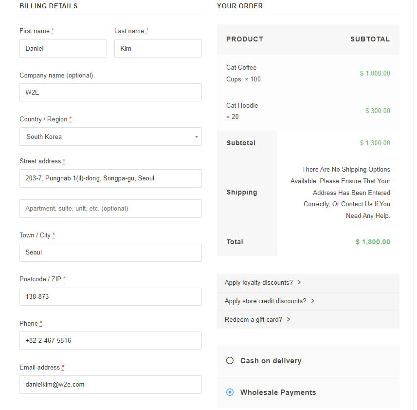
One thing that we recommend, whenever possible, is to opt for a one-page WooCommerce checkout. Within one page, you can fit all of the necessary elements to complete the checkout process, including enabling users to select what payment methods they want to use.
2. Provide multiple trusted payment options
Providing flexible payment options is a key aspect of WooCommerce checkout page customization. This is especially true for wholesale buyers. Since these customers buy in bulk, often invest substantial amounts in your business. The last thing you want is to frustrate them during checkout with limited payment options.
Plugins like Wholesale Payments allow you to cater to this need seamlessly. With this plugin, WooCommerce wholesalers can provide flexible and secure payment options to their wholesale customers. It features pre-configured payment plans often used in B2B transactions, automates invoicing, and allows your wholesale customers to pay in their preferred payment methods conveniently.
3. Customize your checkout forms
Forms are one of the most critical elements in the modern web and their primary attribute should be that they’re easy to use. By that, we mean the following:
- Forms should be easy to select or click on
- Users should understand the purpose of each form at a glance
- If you’re using lists or other interactive elements, they should be easy to navigate
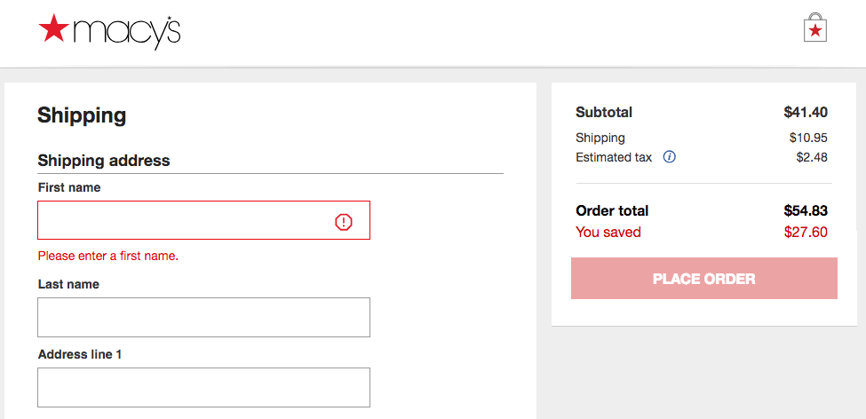
In most cases, simplicity is your best option when it comes to checkout pages. Forms should be straightforward and they should let customers know if they’re missing any key information:
It’s also important to consider mobile users when it comes to checkout pages. Most users interact with the web mainly through mobile devices these days and that means they use those devices to make purchases as well.
All things considered, your checkout page should be just as easy to use on a small screen as on a larger one. Fortunately, WooCommerce enables you to customize almost every aspect of your checkout page, including form styles and which fields to include.
4. Include trust-building elements
Although most people are used to making online purchases these days, there are still concerns about security in a lot of cases. In short, customers want to know that the websites they buy from are safe, particularly if it’s their first time doing so.
Since we’re talking about a WooCommerce store and not Amazon, you need to prove that you’re ‘trustworthy’. For an online store that can mean many things, such as:
- Having customer reviews on your site
- Offering client testimonials
- Ensuring that your store uses HTTPS encryption
- Including trust or security badges
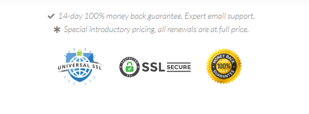
You should already be following most of those best practices as a rule of thumb. However, one thing that you might not be doing yet is including security or trust badges on your checkout page:
Trust badges tell visitors that you meet some specific criteria when it comes to how you protect their data or secure the checkout process. Other badges, such as a money-back guarantee, don’t require any certifications but they can increase trust all the same.
Ideally, these badges should appear on your WooCommerce checkout page but not distract from the payment process. They’re there to assuage customer doubts, but not to steal attention from more important elements.
Conclusion
Optimizing your WooCommerce checkout page can be just as effective as offering discounts or stocking your store with popular products. If you already have a steady base of customers, making some small changes to your checkout page can have a significant impact on your revenue.
So let’s review, here are the four WooCommerce checkout page customization strategies we shared with you:
- Simplify the checkout process
- Provide multiple trusted payment options
- Customize your checkout forms
- Include trust-building elements
Do you have any questions about how to optimize your WooCommerce checkout page? Let’s go over them in the comments section below!

