It’s no secret that the global economy is in a tailspin. With the rise of digital commerce and online services, many e-commerce store owners are shifting their focus to areas that will increase e-commerce conversions.
A higher conversion rate means your customers will come away from their purchase feeling happy, which means they will be more likely to make another purchase from your business. Moreover, an increase in conversions can also be seen as a sign of good things for an e-commerce site.
In this article, we’ll discuss 5 unusually high-impact areas in your business that will guarantee an increase in conversions. We will also walk you through a handful of examples to guide you effectively in growing your WooCommerce store. Let’s get into it!
If It’s Easy, Why Don’t More People Optimize Their Stores?
The main reason people don’t just sit there tweaking their site and getting these huge gains in revenue is that most times, an e-commerce site is developed, and then the owners move on to more important things like the setup and running of the day-to-day business.
Increasing revenue is often left to increasing the advertising spend or waiting for word of mouth to kick in. Or worse, lumping into the lap of developers that aren’t marketing people.
Knowing how to tweak and optimize an e-commerce store is one marketing task that tends to take a back seat or isn’t even budgeted for.
But tweaking your website’s performance in very specific and measurable ways is something that:
- It doesn’t have to cost a lot; and
- It is a one-time investment that will reap benefits forever
5 Unusually High-Impact Areas That Will Increase E-Commerce Conversions
Digital marketing will continue to evolve at a rapid pace. While the digital landscape has become much more stable in recent years, many changes are still ahead. It is easy to get complacent when you see market share gains or new technologies rising to prominence.
However, adopting new technologies is often a sign that other markets are also ready to adopt them. That’s what happened with search and social media platforms. As a result, we have seen increasing levels of conversions on websites that have already been well-established.
This section lists five unique high-impact areas for e-commerce websites that will increase their online store’s conversion rates:
High Impact Area #1: Individual Product Page
Your product pages are where the magic begins.
It’s often where your customers hang around doing a lot of research and deliberation about whether they should buy your product.
So it’s not surprising when you look at your Google Analytics to see these pages ranking as some of the highest “time on page” pages on your site. Often it’s the simple things that are overlooked!
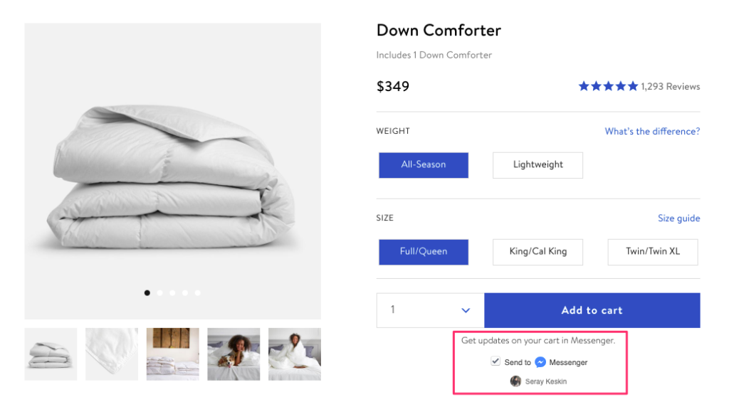
Is Your Add To Cart Button Prominent Enough?
The Add To Cart button is the most sensitive element on your product page.
If you haven’t tested optimizing it yet, then a simple test you can run would be to try changing the color of the button. You can even try boosting the size or giving it more breathing space around the button to make it appear to stand out more.
Ideally, when you stand 5 meters from your computer screen, it should be the main thing you can see on the page. This is often known as the “Stand Back Test.”
I’ve seen designs where the add-to-cart button was just a flat, drab-looking rectangle. When we made it look like a real clickable button, the number of people clicking on it increased dramatically (over ~200%), which had huge downstream effects on the business.
Jazz Up Your Product Descriptions
Could you enhance the product description by providing more relevant information or a video to help digest what the product is for?
Extra information like how to use it, how it comes packaged, and anything else they might have questions about can help put customer concerns to bed. You can also address commonly asked product questions in your description text through a short FAQ section.
Start the list of questions by brainstorming what you think might be common objections to buying your product, then add to this list over time with your responses to actual customer queries.
Add A Product Questions Form
Adding a product questions form can help you identify people’s objects without resorting to a live chat system that costs time and money to implement.
A simple form tool to use is WPForms which will let you create simple forms easily and add them to any page. Formidable Forms is another great form solution that can do the job and has more advanced features if you want to get fancy with any of your forms.
After a while, it might be worth testing removing this form to see what happens to your conversion rate.
Enable Reviews
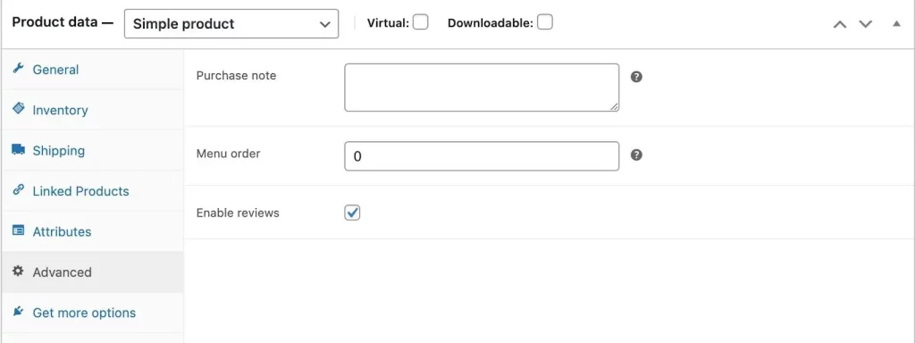
Lastly, in WooCommerce, you can also enable reviews to show positive social proof, which greatly increases buyer confidence.
Showing reviews is one of those things that many e-commerce store owners find hard to swallow. But what happens if someone writes something negative?!
It hardly ever happens, and when it does, it shows that you are willing to accept the good with the bad.
More on reviews in a minute…
High Impact Area #2: Your Shopping Cart Page
When users get to your cart page, it’s time to start pushing them toward taking some action.
By default, though, the cart pages in WooCommerce are made to fit in with the rest of the site. It’s good for compatibility but bad news for conversions. They often end up with irrelevant sidebars or big headers that don’t make sense for a page like this.
In my experience looking at hundreds of e-commerce sites, the cart page (whether well-designed or not) will usually convert at around 10-20%, which isn’t bad.
It means that 2 out of 10 people will go to the checkout page from here onwards.
But you can do a lot better! After the following changes, I’ve seen some cart pages start to convert at well over 60% and sometimes higher! So give them a go and see their effect on your site, getting your customers to proceed to the checkout.
Button Prominence
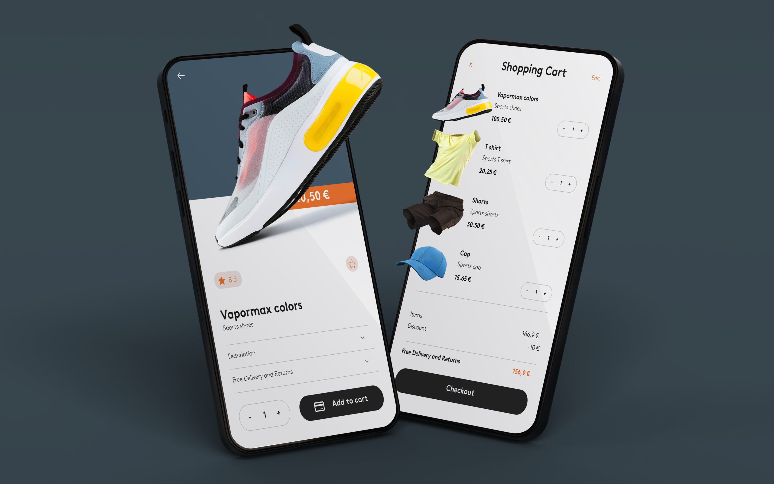
At the risk of sounding like a broken record, the prominence and clarity of the “Proceed to Payment” button should be of utmost importance on this page.
Again, use the “Stand Back Test” to ensure that the Proceed To Checkout button is the element on the page that draws your eye. Try tweaking the button design’s color, size, wording, and visual click-ability to attract attention.
Display Shipping And Taxes
People tend to view the cart page to check what the actual totals will be. Leave the shipping calculator enabled so people can understand the shipping cost.
Did you know that WooCommerce has a Geolocation feature?
“Built-in geolocation support allows your store to auto-detect your customer’s address – making shipping and tax calculations simpler.”
Turn it on and use it so you can display the correct geo-appropriate tax and shipping information on the Cart page.
Remove Distracting Elements To Increase E-Commerce Conversions
Remove all distracting elements from the page.
Ensure that this page doesn’t have any sidebars (unless necessary), and think about trimming the height of your header to move as much of the actual shopping cart information above the fold.
I also advocate removing menus or social buttons from the header and footer.
One Exception: Even though you are removing distractions on this page, don’t remove the option of continuing shopping.
Implement a visible “continue shopping” link at the top of the cart items table, which will take them back to the shop. This will ensure they don’t feel trapped by design but will still give prominence to the Proceed To Checkout button.
High Impact Area #3: The Checkout Experience
The checkout page is the one page on your site where you don’t want them to linger very long.
Go completely distraction-free if possible.
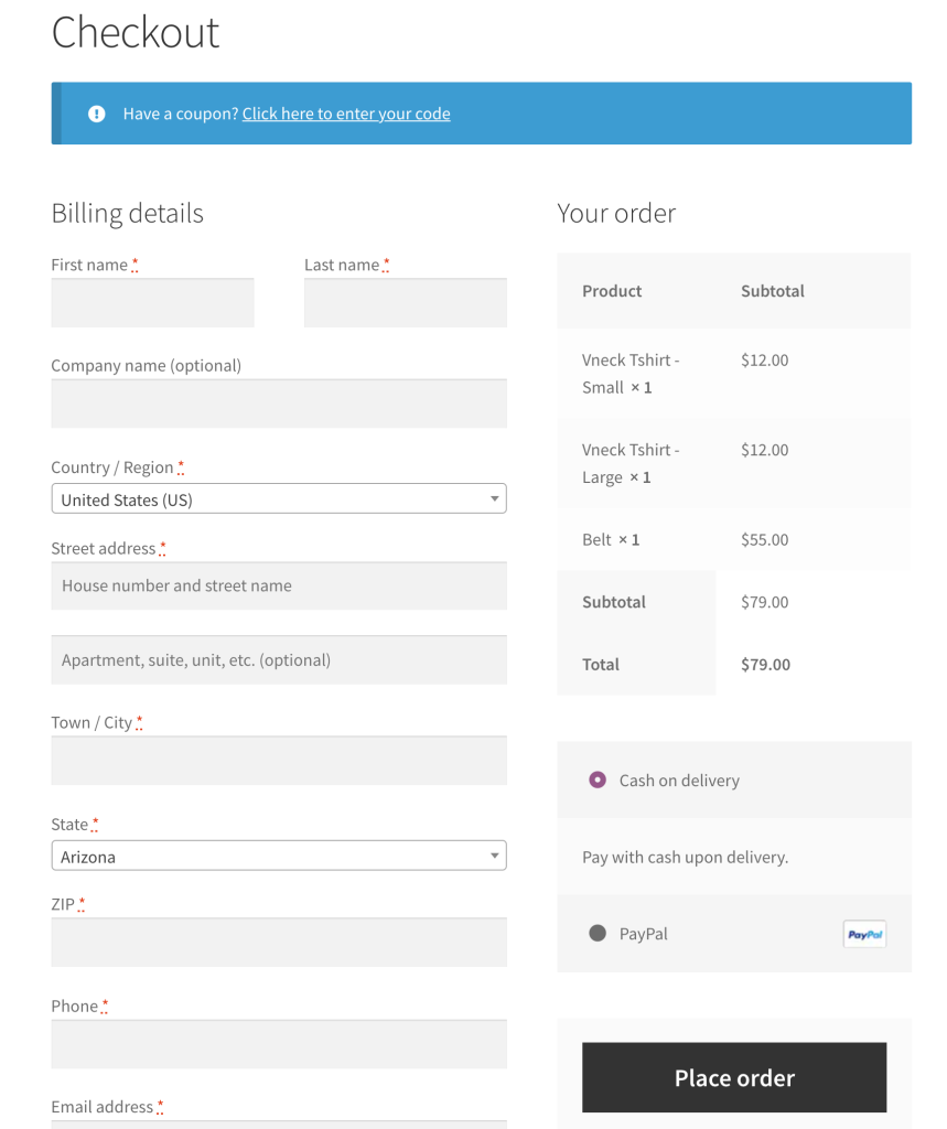
Keep The Form Short
Make the form as simple as possible and remove any excessive data entry that bogs the process.
Many store owners collect loads of information on their checkout pages because they think it will be important for “marketing.” In reality, this information is rarely used and will only drive people away because there’s too much to fill in. I’d reconsider my purchase, too, if there were 30 fields to fill in!
Show Minimal Shipping Options
Try to present minimal shipping options and help the customer by pre-selecting the best price; they will select it anyway, saving them an extra click.
With the cost of shipping, if you can’t offer free shipping, then follow the rule that the simpler the shipping options are, the better they will convert. Showing a normal and express shipping speed is expected; if you have more than this, it only confuses the choice.
Give Multiple Payment Options
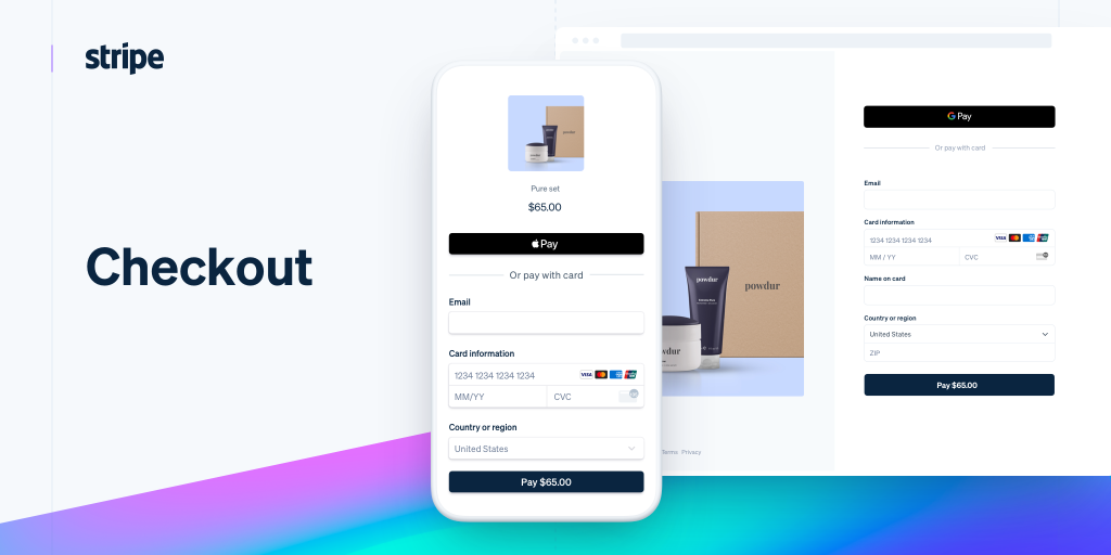
In my experience, you only want to give them a choice in the payment option. Most people use the default PayPal gateway as it’s already turned on in WooCommerce, but why not try to include one other option for Credit Cards exclusively?
After always selling our plugins via PayPal exclusively, I had the same question myself.
After we switched to the Stripe Payment Gateway we saw a 10-20% jump in successful orders and roughly 30% of people paying via the new payment method.
“But PayPal lets you pay via credit card without an account!”
I know, and we used to add a note to our checkout saying this. But even though most customers know that you can pay via credit card with PayPal without an account, not all will. Also, this varies by country, and I’ve seen PayPal change the payment pages depending on the country the buyer comes from, so you can never guarantee this is possible.
In all cases I’ve read about, having the extra payment gateway that lets them pay via credit card on your site without going to PayPal will increase your conversions.
Add An SSL Certificate
Even if you aren’t taking payments directly on your site, I recommend adding a WooCommerce SSL certificate. It’s a tiny investment (here’s one for $12 USD a year at Namecheap) that will pay big bucks in your customer’s perception of security.
People have been trained to “look for the little lock” in their address bar to ensure that the transaction is secure before proceeding, so having this extra protection helps put those doubts to rest straight away.
Once you have your SSL installed (site-wide, preferably not just on the payment pages), you can install SSL and security badges near your “Pay Now” button to give you an even more feeling of security.
Add Nice Accepted Payment Icons
The standard payment icons for most payment gateways with WooCommerce are pretty dull.
I recommend you implement some nice icons to indicate what payment card option they can use.
You can get free/cheap icon sets for almost any payment card imaginable on sites like IconFinder.
High Impact Area #4: Email Collection
There are many articles detailing how to optimize your email address collection, so I’ll make one suggestion that will give you the biggest impact possible: no matter what you read, popup opt-ins work.
But, like anything, implementing them is a good way and a bad way. Gone are the days of irrelevant popups that show up right when you visit a site before you even look at anything.
These days you can tune your opt-in popups to show in a tasteful lightbox, be relevant to the page they’re viewing, and show up on the second-page load after X amount of seconds or via an exit intent detection algorithm.
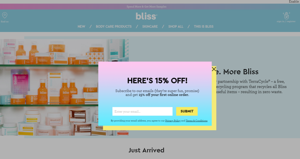
They are the highest impact per page view email opt-in method available. Regardless of whether you like them or not, it is the best method of turning visitors into email addresses on your list that you can re-market to over and over.
Without an email collecting popup, you’re probably leaving a lot of money on the table.
My 2 points of specific advice for making a really good opt-in popup would be to:
- Make a “killer” offer. Something much better than “Join Our Newsletter.” I’m talking about giving away short e-books, email courses, pdf guides, and 10% off coupons for their first order (these work well!).
- Provide useful content. It’s one thing to get someone onto your list, but it is a fruitless exercise if you don’t talk to them. Keep the conversation going by providing regular helpful content. Regular can mean monthly, weekly, or more, depending on your audience, and users can be anything you or others create that leads back to possibly making an order on your site.
High Impact Area #5: Product Reviews
As mentioned earlier, showing reviews on your product pages can increase buyer confidence.
Unfortunately, many store owners have trouble collecting reviews on their product pages and usually choose to disable this feature in WooCommerce.
Resolve To Test Reviews On Your Site
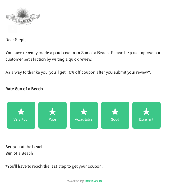
As a test, enable it for the next couple of months and use a review reminder email sent to your customer approximately two weeks after their purchase. This will send them an email to remind them about their order from your store and ask them to write a quick product review.
For physical products, two weeks is usually a good time after receiving their order, so they have a good chance to experience your product and form a valid opinion. For digital products, try a shorter period, like 3-7 days.
What about negative reviews?
It’s hard for most store owners to hit publish on negative reviews, which was the most common objection I faced when suggesting this to e-commerce store owners. But the good news is there’s no better social proof than honest reviews. So publish the good with the bad if you can stomach it!
The bad reviews will give you feedback on how to improve (better pre-sales FAQ, product tweaks, etc.) and will show your audience that you’re listening to everyone, not just the people who give you five stars and praise you.
The Challenge
Now that you’ve read about my 5 high-impact areas to tweak on your e-commerce site, the challenge is thrown down. How far can you take this?
Can you pick 1 or 2 of these items and implement them today?
Be honest – what could you do now to improve your customer experience on your site that could lead to more sales? Tell us about your plans in the comments!

