Are you a wholesaler who’s taken your business online? Then you already know how crucial WooCommerce Add to Cart buttons are to your e-commerce store. After all, without these buttons, how can your customers purchase your goods?
However, there’s another important factor that many store owners fail to consider: their Add to Cart notification system.
Let’s cut to the chase. When your Add to Cart notices are easy on the eyes, they’re more likely to encourage your customers to behave in ways that can benefit your store. But when they’re a headache-inducing nightmare of popups that take over your entire screen, they can make shoppers run screaming from your website.
In today’s post, we’ll discuss the advantages of simplifying your WooCommerce Add to Cart notices. In addition, we’ll give you an easy, 2-step guide on how to use Wholesale Order Form to give these notices a neater, more appealing appearance.
So let’s get started!
Non-Simplified WooCommerce Add To Cart Notices
Our WooCommerce plugin, Wholesale Order Form, comes with a feature that lets you create Add to Cart buttons for your online store.
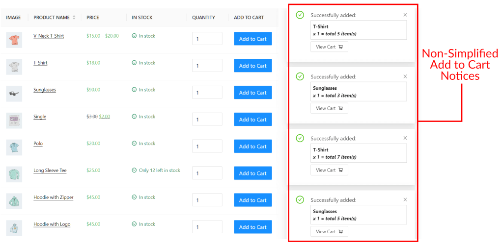
When a customer clicks an Add to Cart button on the front end, Wholesale Order Form displays a large and potentially obtrusive popup/slide notification on the right side of the screen. Clicking a notice’s “View Cart” prompt redirects the customer to their cart so that they can complete the checkout process.
Here’s the problem: if a customer quickly clicks multiple Add to Cart buttons one after another, the system floods the screen with these popup/slide notifications. This results in a crowded look that can overwhelm the customer:
Furthermore, the more notifications there are on the screen, the more difficult it is for the customer to know where to click to be taken to their cart.
One way around these problems is to reduce the Add to Cart notification duration so that each notification only appears briefly on the screen. Another is to simply disable notifications altogether.
However, a better solution is to take advantage of the Simplify Add to Cart Notices option that we introduced in Wholesale Order Form Version 3.0.
But why simplify the Add to Cart notices on your WooCommerce store in the first place? What good would it do your online wholesale store?
Why You Should Simplify Your WooCommerce Add To Cart Notices
Clean and simple Add to Cart notices are important for several reasons:
1. Improved aesthetics
A messy notification system can be offputting. In the worst of cases, it can encourage customers to avoid visiting your order form, leading to a drop in sales.
Thankfully, a neat and uncluttered Add to Cart notification system improves the overall aesthetic of your wholesale order form. This makes your store more inviting to customers, encouraging them to keep making purchases.
2. Enhanced user experience
Unobtrusive Add to Cart notices can enhance the user experience. They prevent the confusion and frustration that an overwhelming number of popup/slide notifications can produce.
As a result, customers feel more comfortable using your order form, encouraging them to use it often to purchase your items.
3. Better clarity
Clear and concise Add to Cart notices eliminate any ambiguity or uncertainty for users. By using basic yet recognizable icons and a minimal amount of text, customers enjoy quick and convenient access to relevant information. In addition, they can immediately identify where to click to add an item to their cart.
All this reduces the risk of misunderstandings and ensures a smoother shopping experience.
4. Conversion rate optimization
An optimized Add to Cart notification system contributes to higher conversion rates.
When your notices are uncomplicated, customers are more likely to complete their purchases without abandoning their shopping carts. This, in turn, increases the likelihood of generating revenue and improving the overall success of your e-commerce store.
Our Easy 2-Step Guide On How To Simplify Your Online Store’s WooCommerce Add To Cart Notices
Now that we’ve established how simple and clean Add to Cart notices can benefit your store, let’s find out how you can simplify your WooCommerce Add to Cart notification system.
However, before we get started, know that to use this Add to Cart option, you’ll need two important tools:
- The WooCommerce e-commerce platform
- The latest version of our Wholesale Order Form plugin
Thus, we’re going to assume you’ve already installed and activated both WooCommerce and Wholesale Order Form. Furthermore, make sure Wholesale Order Form is updated to Version 3.0 or above.
Step 1: Create an order form with Add to Cart buttons
The first step is to create a new order form or edit an existing one.
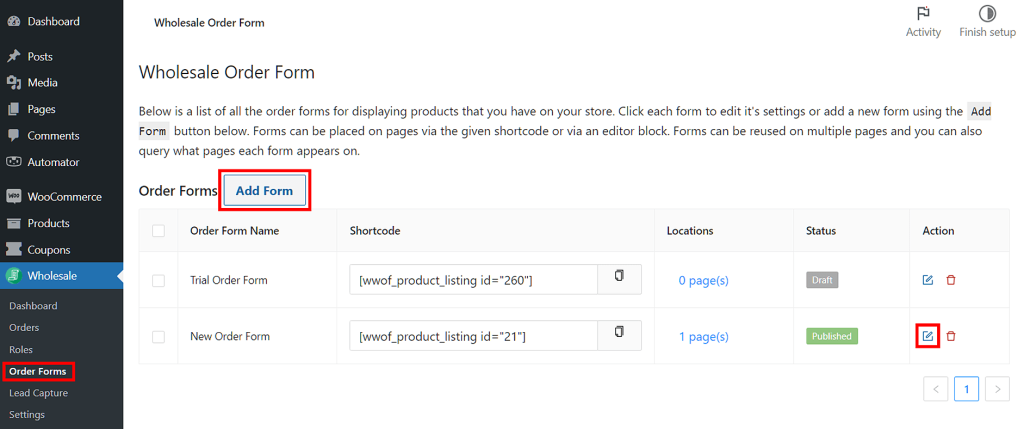
On your WordPress dashboard, head to Wholesale > Order Forms. Then, click the Add Form button to create a new form. Alternatively, you can edit an existing form by clicking its Edit button.
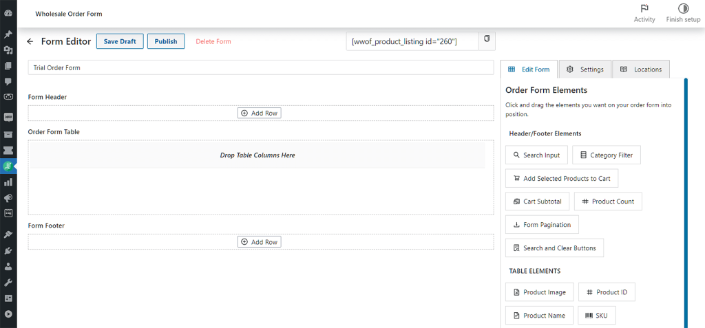
Whatever your choice, you’ll be taken to the Form Editor page.
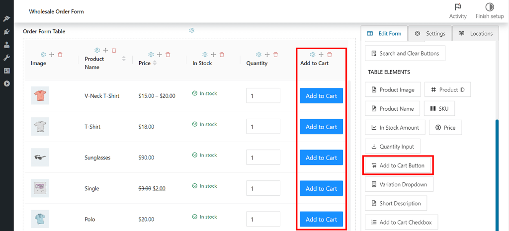
Your order form should have header, table, and footer elements. More importantly, make sure to give your form the Add to Cart button functionality. To do this, drag the Add to Cart Button module from Table Elements, then drop it into the Order Form Table space.
For detailed instructions on how to create or edit an order form, check out the following guides:
- A Step-by-Step Guide To WooCommerce Quick Order Forms
- Knowledge Base: WooCommerce Wholesale Order Form Getting Started Guide
Step 2: Simplify your Add to Cart notices
Now that your form has Add to Cart buttons, it’s time to simplify your WooCommerce Add to Cart notifications.
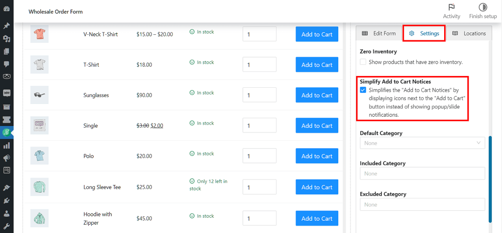
First, click the Settings tab on the right-hand column of the Form Editor page. Next, scroll down to the Simplify Add to Cart Notices option, then tick its checkbox.
So, how does this simplify your WooCommerce Add to Cart notices?
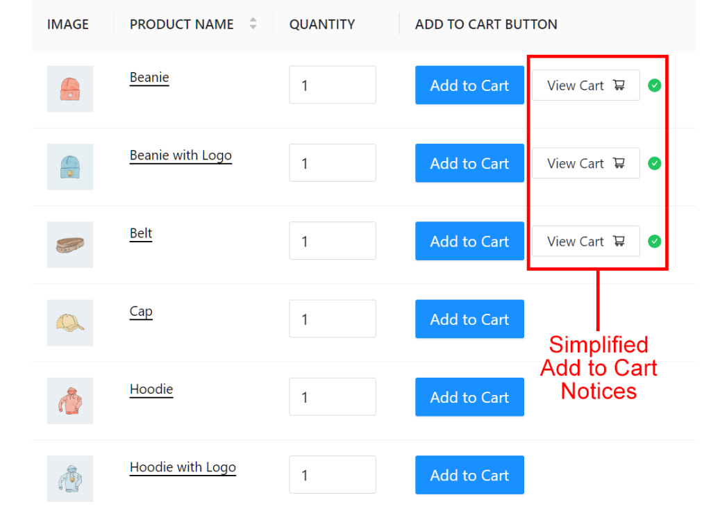
On the front end, every time a customer clicks the Add to Cart buttons, the system no longer displays popup/slide notifications.
Instead, it displays two small and simple elements next to each button: a “View Cart” prompt and a green checkmark. We’ve illustrated this below:
As you can see, this produces a cleaner, plainer appearance.
Moreover, by presenting the “View Cart” prompts in a simple and more organized manner, customers will have an easier time finding and clicking one whenever they want to proceed to checkout.
Don’t forget: once you’re happy with your simplified WooCommmerce Add to Cart notices, click the Publish or Update button near the top of the page to save your work!
Take note:
Enabling the Simplify Add to Cart Notices option effects the table element Add to Cart Button and the header/footer element Add Selected Products to Cart. Specifically, it hides the following controls:
- Enable Add to Cart Notification
- Notification Duration
Keep this in mind when simplifying your WooCommerce Add to Cart notifications!
Conclusion
Having clean and simple Add to Cart notifications can benefit your business in various ways.
To recap, simplifying your WooCommerce Add to Cart notices can lead to:
Thankfully, you can simplify your WooCommerce Add to Cart notices in two easy steps:
Do you have any questions about how to simplify your WooCommerce Add to Cart notices? Let us know in the comments section below!

